Contact Me
Reporting and Analytics
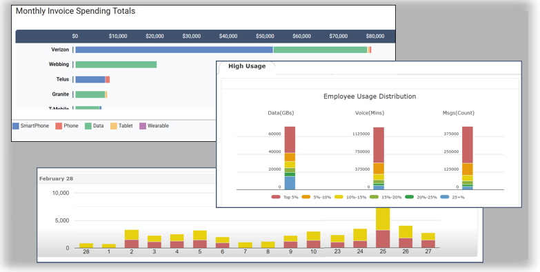
In addition to making data easy to find and display, MobilSentry brings together important metrics including usage and charge information combined with accurate representation of the employee, employment status, employee’s organization and management along with needed accounting information for monthly charge back. These represent the key design components of the reporting functionality:
- Intuitive Interface
- Data Integration from carrier and HR sources
- Granular graphical and tabular views
- Insight analytics facilitates decision making
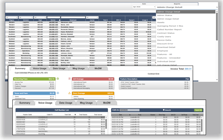
Carrier Portal Experience
The carrier portals present multiple menus in an export-heavy experience. Once desired information is identified from the report list, that report must be requested, which can involve processing delays, and then the results must be exported to view the details.
Data retrieval steps:
Identify and submit report
Locate and export report
Review and manage spreadsheets
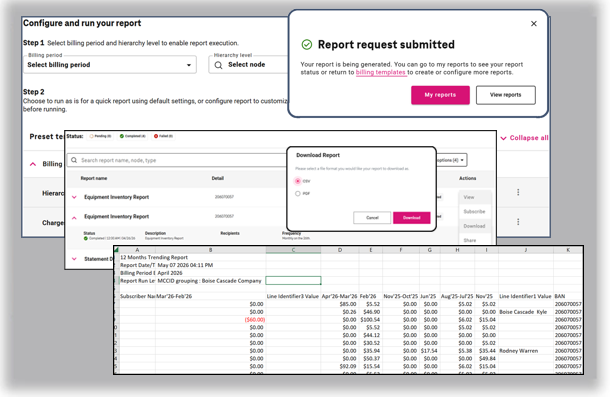
MobilSentry Experience
Visually layered displays integrate information on a selected list of browser-based reports, which can then be searched, filtered and sorted to locate the desired information. Once identified, the user can access individual device charge and usage information by simply clicking on links and tabs to reveal all feature, usage and charge information available on carrier invoices. Any filtered data can be exported as well.
Navigation process:
Choose report from cascade menu
Sort and filter as needed
Click device link for invoice details
Click tab for current month usage
Export as needed
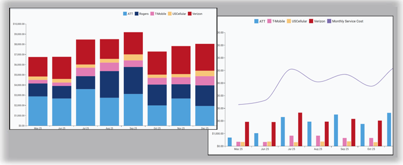
Graphical Display of Key Metrics & Trends
Dashboards present information on important usage and charge metrics supporting analysis and decision support. Trending and comparative information by time, carrier, location and even individual users are easily accessed at the click of a button.
Powerful Data Charting Toolset
All current and historical data is available to the Data Charting tools. Graphs can be generated in bar, clustered bar or line formats for any desired timeframe. Multiple data elements can be represented on a single charge such as total charges versus device count over a 12, 24 or 36-month period.